Friday 10 June 2011

rest of the report

Now i have the copy for the report i can carry on with it.
I wanted the main body of type for the report to be quite standard, and sticks to a strict grid system as it will just be typography.


I used a six column grid system, but to create a more dynamic look i didn't use all the columns. I wanted it to be asymmetric to make it look more interesting.

I used the black borders so the type didn't look as though it was floating.
I still wanted to keep the same styling from the previous pages, so used the type and colours to keep consistency.


Eventhough there is a lot of type on these two pages, it works because of the grid system.
The mix of type just makes it look a little bit more interesting, with the different colours typefaces and point sizes.


These are the rest of the pages, keeping the layout with the black borders to keep consistency, and using the same orange and blue type for the type that needs to stand out.
I also used the dotted lines from the logo, to reinforce the brand.

Mock ups of this will be in my development folder.


Monday 23 May 2011

success stories

I kept to my word of using one page for a black and white image and the other for typography, this is what i came up with.


I used the same layout and grid system as the previous page so it would be easier, but also look as though both pages are from the same brochure. 
I also kept the same statement typography, i think it just adds something extra rather than just plain type. I also used the corporate colours to keep the theme of the company going.


Again not much has changed with this success story in terms of layout, apart from what pages are used for the type and image. I decided to swap them round to just to add aesthetic interest.
I also changed the colour of the background to grey as i felt it worked well with the colours used in the typography and it has a nice contrast with the image.

It's simple, but it works and i feel it has a strong effect.


Thursday 19 May 2011

ideas for annual report

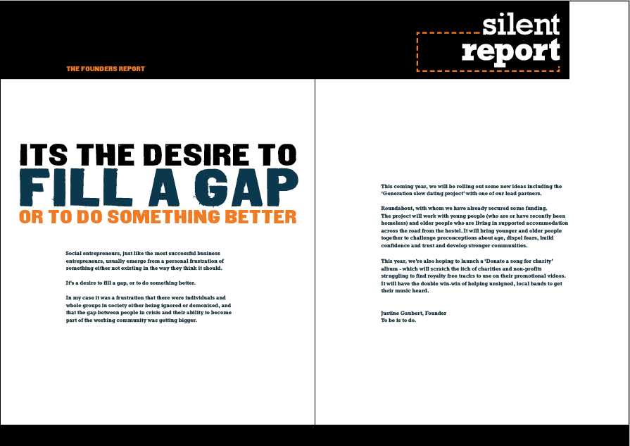
I wanted the annual report to reflect the posters to keep consistency. So decided to keep the same brand colours and black and white photos throughout the whole annual report.


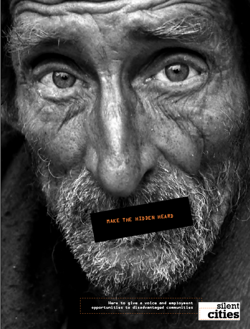
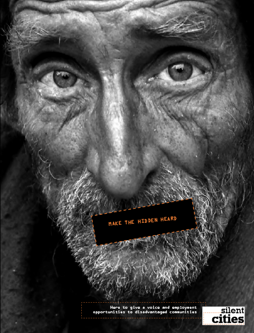
This is the first layout for the front and back cover, i used the same styling as the posters using the black mouth covering, filled this with the logo and annual report 2011. I think it still gets the message across well. 
I used orange for the background colour to add more interest to the brochure, it's the same orange as the brand colours. I also extended the black box across the back of the brochure, to show a bit of contrast and i took inspiration from the BP annual report.


This is the first double page spread of the annual report, i wanted to make a statement of the aims of the company, just to set the tone for the rest of the report, Again i kept the same styling from the posters, just added one extra colour. I used blue as it's opposite on the colour wheel from orange so it has a nice contrast.
I have also made a statement of the dotted lines to isolate the typography, i want to make a feature of the dotted lines as i feel they work well with the photography used.
I used orange on typography to create hierarchy and to make the more important information stand out more. I made the type in blue bigger to make it look more interesting.


This is the layout for a success story of the report, I like the page with the grey brick wall it still fits in well with the overall look of the posters used and the front cover. However i'm not too sure about the other page, i like the colours and the brick wall coming through the blue background. but not the layout and the image used.

I will try another layout with another layout, making the quote more prominent.


I got some inspiration from books on brochures and annual reports for the typography.
I made it the story of the girl on the previous page, as i didn't want an image on it because i felt it added cluttered that wasn't necessary.

I think it works well with just a page full of type as it adds contrast to the other page because its image. My idea for the next success stories to just have a full page image of the person in black and white and the other page being the success story. 

I only did the first success story like this because i used an image on the previous page, but i still think it works well.


Wednesday 18 May 2011

annual report design

I needed some inspiration when it comes to the annual report, because they are generally quite boring. So i decided to look on the internet to see whether i could find any decent ones.


This is annual report for BP, this is the least interesting one i could find. It is still quite nice looking though, as it has a lot of white space considering the amount of typography used.
I really like how the company colours are used throughout the brochure, it reinforces the brand. But it just common sense to use them.

I really like the design on the front cover, how it overlaps both pages, i may have to consider this for my own. I also like the black and white photography with the use of colour from the logo, this is something else i will consider because i will be using black and white photograpy in my own designs.


This is the annual report for Helly Hansen, again the annual report reflects the company really well, as they specialise in outdoor gear. I really like the front cover made from wood, gives it a really handmade feel.

The colours used throughout are kept to earthy colours to reinforce the overall brand. Again there is nice structure of typography and heirachy. It looks very sleek but does well portraying the company.


 This is Billabongs annual report, it is really vibrant and has a lot going on within the brochure. However i really like it, it just shows me i can make the annual report anything i want it to be.


I don't feel as restricted now looking at all these the Billabong one has really opened my eyes to how it can look. Even the finanicial overview still has the design feel and looks as though it belongs with the rest of the report.  It carries nice structure and a grid system.


Now come the design layouts.
 

Tuesday 17 May 2011

adding typography

Now i had an idea to how my poster was going to look i decided to play around with some type of the poster and this is what i came up with.


I tried it with a different image to see wether it would be appropriate on all the images used.


Getting the type to work on the poster wasn't hard, i wanted it to be the same typeface used on the mouth covering, this is to keep consistency.
I also used the Silent Cities colours so it looked as though it belonged to the company.

To make the type at the bottom more visible i used white for contrast on the dark background and used the orange border used in the logo. I did this to again keep consistency, but to also stop the type look as though it is floating.

My other idea was to have the orange border around the mouth covering:


As i found it hard to choose which poster looked the best, i gave justine an email to get her thoughts and views on them both. She liked the orange around the mouth covering, she thought it was very strong, I however like the look of them both. I suppose its down to my personal opinion, but i will ask fellow students their opinions also.

This may not be the final layout, adjustments may be made if needed, i.e the typography at the bottom may need enlarging. I will sort this when i have done some trial print outs.


Thursday 12 May 2011

further ideas

After running this idea past my tutor, i decided not to use the QR code as it would only aim the charity at one target audience-  students that know about technology, anyone else may not know what it is. Plus students are less likely to be interested in charities anyway as they are usually pretty skint.


Time for a re- think.


I looked back over the research and i really liked the NSPCC idea of ripping the area of the mouth away, i had thought of this idea originally then found it on the net, but i my still do it depending on what else i can think off.


Below shows an example of how it may look


I don't think it looks too bad, obviously when it has all the relevant type on it and is actually ripped it may add to the effect a lot more.


Or i was thinking about doing a censor type strip that goes across the mouth, black box type of thing what is commonly used.


Out of the two images i prefer this one, i'm not sure wether it's because it looks better because the other one is a mock up. I think it's because it's black and the photo is black and white. so the colours fit nicely into it. It's simple but gets the message across, however i don't know wether it's been done too many times before. I just really like the visual look of it.


I thought i'd try it with the rip just to see what it looks like and now i can't decide between the two of them.


They both send out the same message but in a slightly different way. i may have to consult a few people to see their views on it.


Before i asked though i just wanted to try something out with the black rectangle over her mouth, just to see what it would look like.


I used the original slogan of make the hidden heard, which also works well as the lips are hidden. i have also used the orange from the Silent Cities logo for the type to keep consistency. I don't mind how this look, by adding the typography enforces what the poster is trying to say.


Wednesday 11 May 2011

slogan ideas

I need a slogan for the promotion, i want it to link in with the image so it needs to be something to do with silence and/or voices that can't or aren't be heard. So that it also links in with Silent Cities as a company.


I found this image which i think will be helpful when thinking of a slogan:


But instead of the word 'visible' link it with sound, so something like heard or understood. As i can't use the same slogan.

MAKE THE HIDDEN HEARD- which i think would work really well as it links with the person being hidden because they don't have a voice, therefore they can't be heard.

Also hidden because the QR code hides it until it is scanned.
I don't know wether i will be able to get away with this because it's a bit to close to Nike's slogan, so i will think about other possible slogans.